Design a day challange| Day 1
In order to cultivate the ability to be more intentional in web-design and gain sharper knowledge, you must practice relentlessly.
Inspired by the legendary Gary Simon from Design Course, I decided to start a 100-day long web-design design challenge. In order to best learn and gain accountability, I will try and post it all here.
Check out his video if you also want to try it: Here is the link
Entry One| Three cards, a title and disorganized text
 Within every design that I do, I aim to be clear in communicating its function. In addition, I like to emphasise the theme that the design carries. For this first prompt. Here are some details I want to highlight:
- The "moon"
- The cryptocurrency Binance aspect
But before I can do that, I must first figure out how I am going to order it
The title| I think making the title big and clear isn't much of a debate here since it sets up the whole BNB context.
The three cards| Cards can look really boring and plain when arranged in a row. So I decided to take a risk and arrange the cards with one of them at the centre and place the other two cards a tad smaller at the sides.
Checkpoint| This is what It looks like with the base changes:
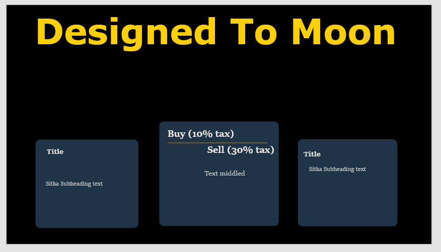
We are now only halfway through.
*💡Text Tip| When you have two words that are antonym related, meaning they share opposite meanings, you can exploit that by distinguishing their difference in your design. ex "Cold and Hot", "win and Lose" or the ones I used: "Buy and Sell".
What difference does it make? It helps emphasise the meaning visually as well as create a clarification of a certain concept. When done right it can actually engage the Users attention to the text
New Objectives This looked a little bit bland to me, so I have three options to create a bit of excitement within the site. Colour, shape and illustrations. Because this design is all about BNB, I have to prioritize communicating that core aspect to the users above anything else. One trick I use to determine if I need to add a visual element is by looking for words that evoke Imagery, looking at the title, the term "moon" immediately creates a picture of the moon when I read it and so adding a moon illustration somewhere in the image would be a good idea since it maintains the context. I like to place these considerations within a list:
- Make it clear that this page is about BNB
- Add a moon illustration somewhere
Having this list also gives me an idea of what Colours to use within my page.
💡When to use an illustration| As I mentioned before, look for terms within the design that create a mental image when read. Usually, you would find them in the headings of sub-headings. If not, you can also think about the overall theme of the page.
Why? We humans are visual thinkers, to remember and also make sense of sentences we like to visualise them within our minds. having illustrations of those words makes the user feel more comfortable on the page, especially if it has a lot of words, having images can make it more enjoyable and even set the mood of the page.
- First| I decided to place a Binance symbol at the centre of the page --> this also made use of that empty space on the page. I thought about placing it next to the title or in a corner somewhere but it wasn't noticeable enough, I also felt as if the text boxes would be left too isolated, having isolated elements within a page can look a bit "unprofessional".
personally I never design anything with the goal of being "professional" mainly because it contradicts any attempt to design something that is attractive and original. --But that's just my opinion
However, for the sake of simplicity, I needed everything to be close but have enough breathing room to not look cluttered. I could achieve this by minimizing the text or using contrasting colours.
Then| The centre card needed to maintain its visual dominance, so I layered it at the top of the symbol. In my opinion, the heading looked better behind the symbol -- I think it's because the yellow gives the symbol more attraction by being below it.
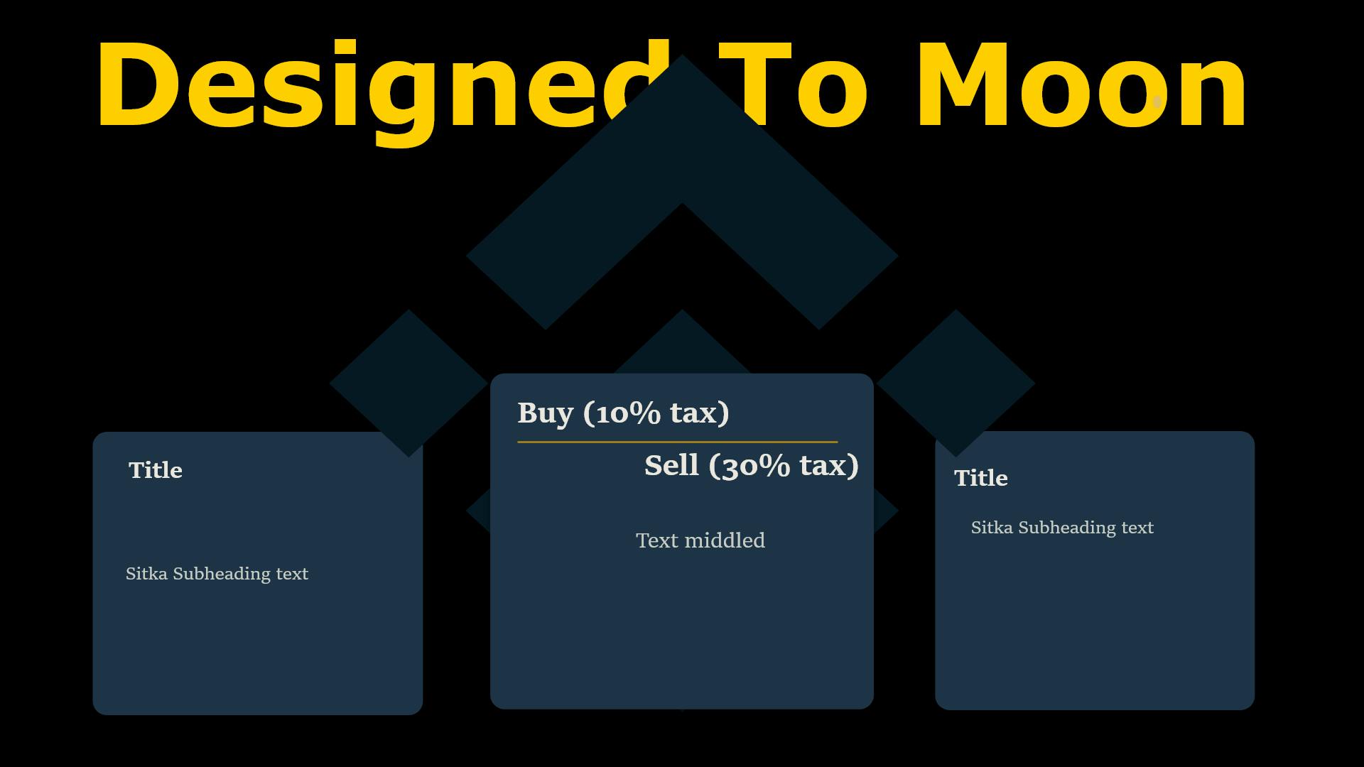
The last thing to do now is to add a little more decoration to the page. I thought about where I wanted to place the moon as well as possible shapes and colours to use within the design. Here is my thought process:
- I like the Yellow heading, but I don't think I can add any other element with that same brightness, it might deter the attention away from the heading.
- Maybe a darker shade of yellow would be most effective, I can use the coolers site to try it out (not a sponsor )
- I think adding circular shapes behind the two cards might help to elevate the cards towards a better view (layering wise)
- But that damn moon, ughhh, where could I place it 😫
- Speaking of moons, talking to the moon is a really nice song, think I might listen to it for inspiration 😉
Placement one
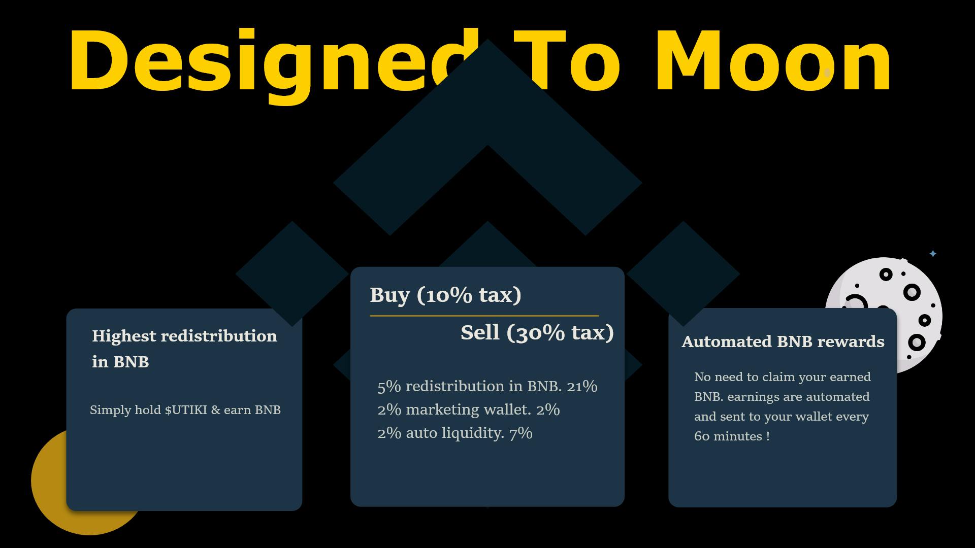
- Tooo basic, the moon kinda looks like an extra in the photoIcons made by Freepik from www.flaticon.com
Placement Two
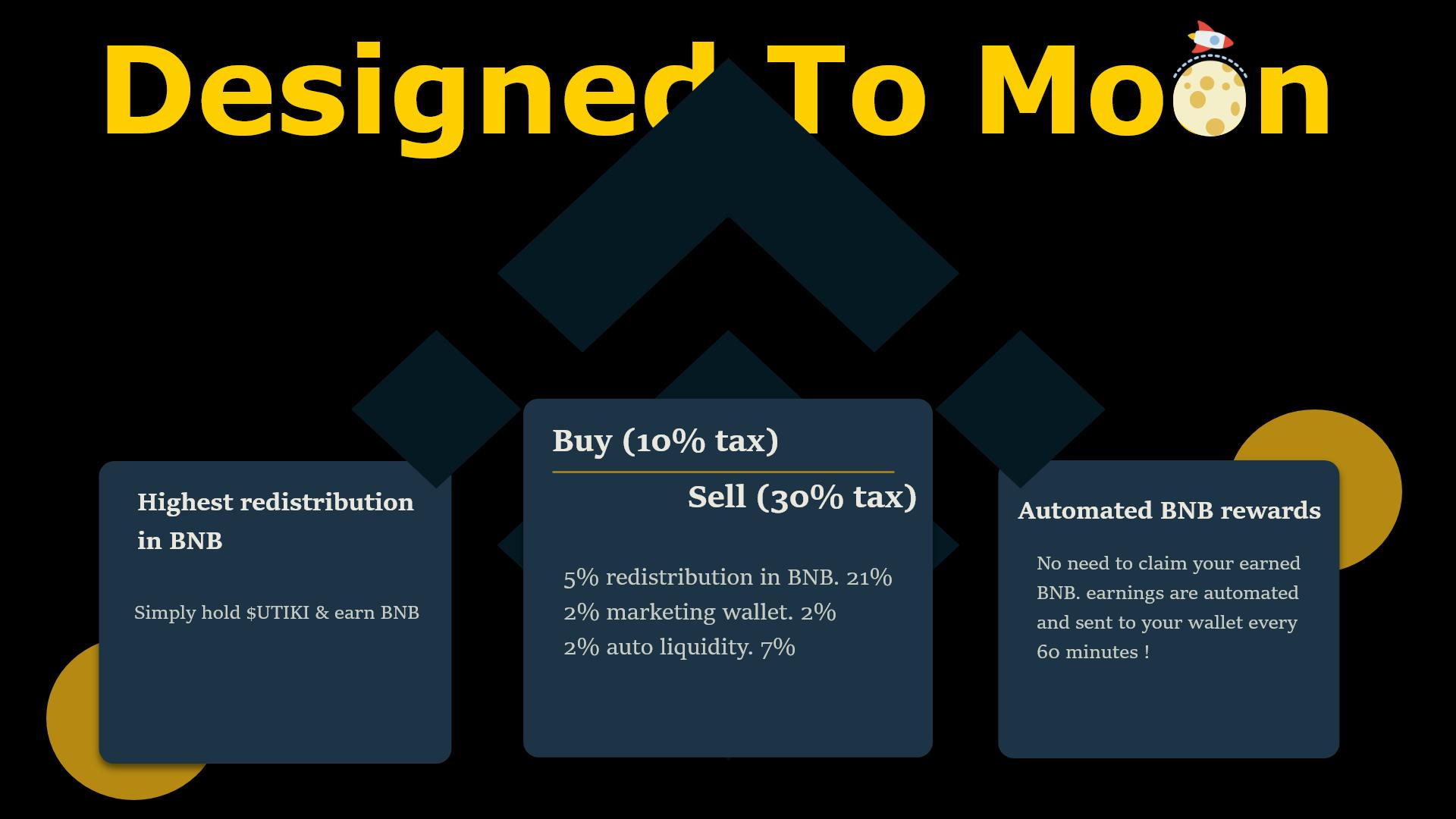
- Let me take this 'moon' visual to a new level, I could add a rocket to also add an implicit meaning of progress and rapid growth.
- The yellow moon kinda looks like a dinosaur egg 🐱🐉
- 🤔I don't really like that rocket, Its a bit immature and childish. But at the same time, it does lighten up the overall design
Final Placement
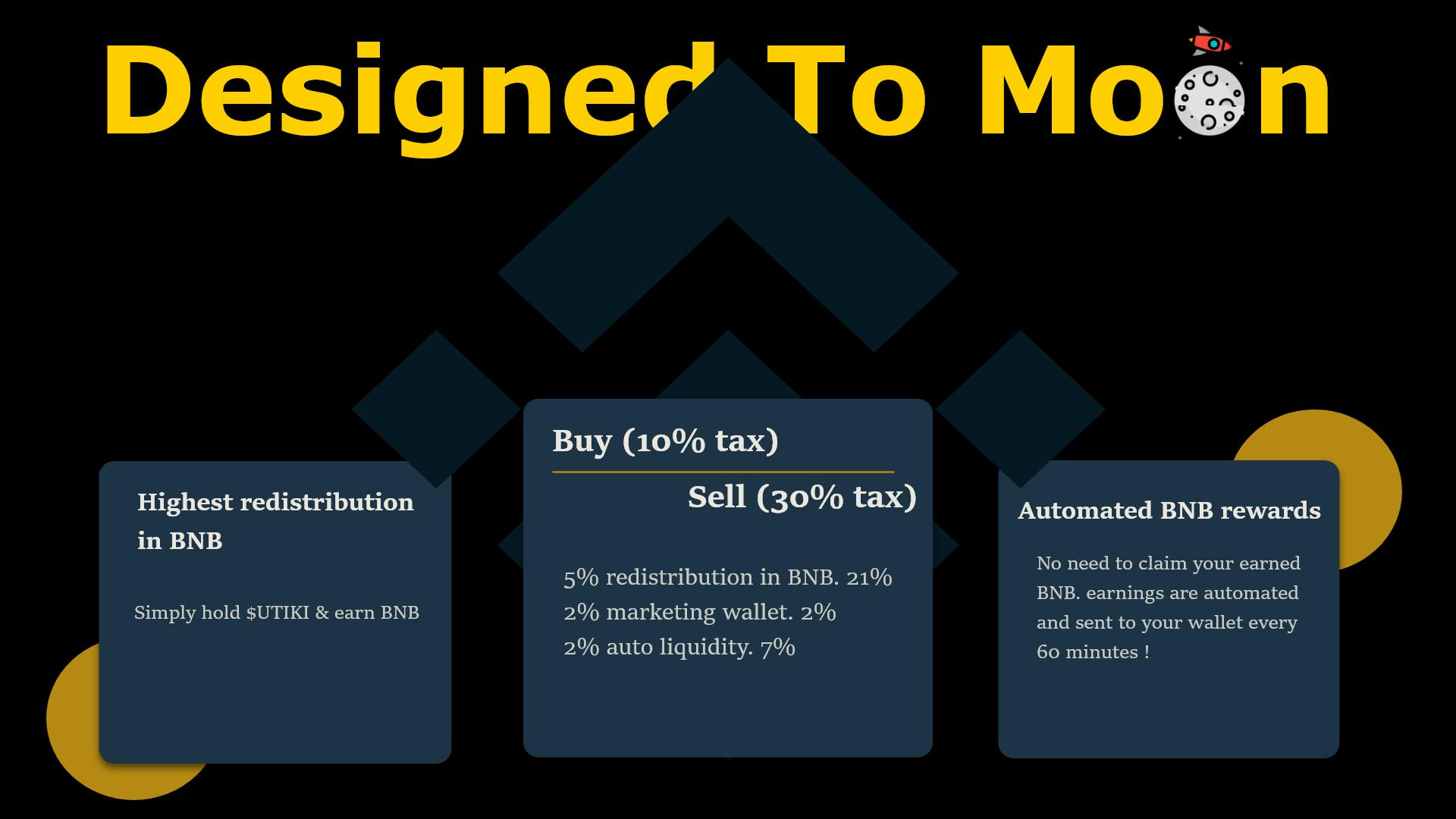 Am I happy with it? Nope, But do I have time to complain, Not anymore, so I will just settle on this (for nowww).
The final product
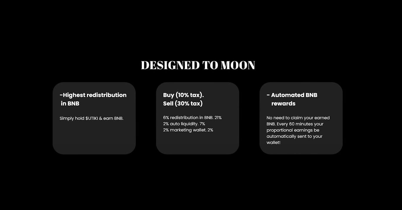
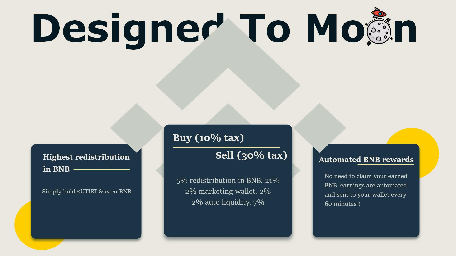
I really Liked that golden line on the middlebox, So I decided to spread it across. Here is the final design. I always like to keep an alternative version of the original design in case I wanted to explore a different path. at the bottom Is a version where I used lighter colours
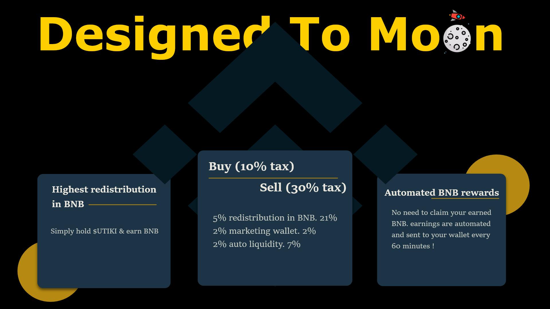
- The only negative I have on it, is that It looks a little too dark
Typography
In case anyone cares I used "Verdana" as the heading. It was the most simple yet bold font that commanded attention.
I utilized "Sitka Subheading text" as both sub-heading and child text deliberately. Times new roman, Verdana and any other font did quite have the effect I was looking for. I needed something that had some elegance and class, that's because cryptocurrency (in my view) carries a rich upper-class connotation. And I wanted to highlight that within the text. Times new roman was a little too thin (even the bold font) and calibre and Arial just didn't have any elegance to them (im talking about curvature). And so Sitka was one of the only fonts I know (at this current moment) that communicated what I wanted
👋Thanks for reading
