Practice does not make perfect, Only perfect practice makes perfect
I forgot to upload the entry for day 2😅. Inspired by the legendary Gary Simon from Design Course, I decided to start a 100-day long web-design design challenge. In order to best learn and gain accountability, I will try and post it all here.
Check out his video if you want to also attempt redesigning the entries: Here is the link
Entry 2| Service section
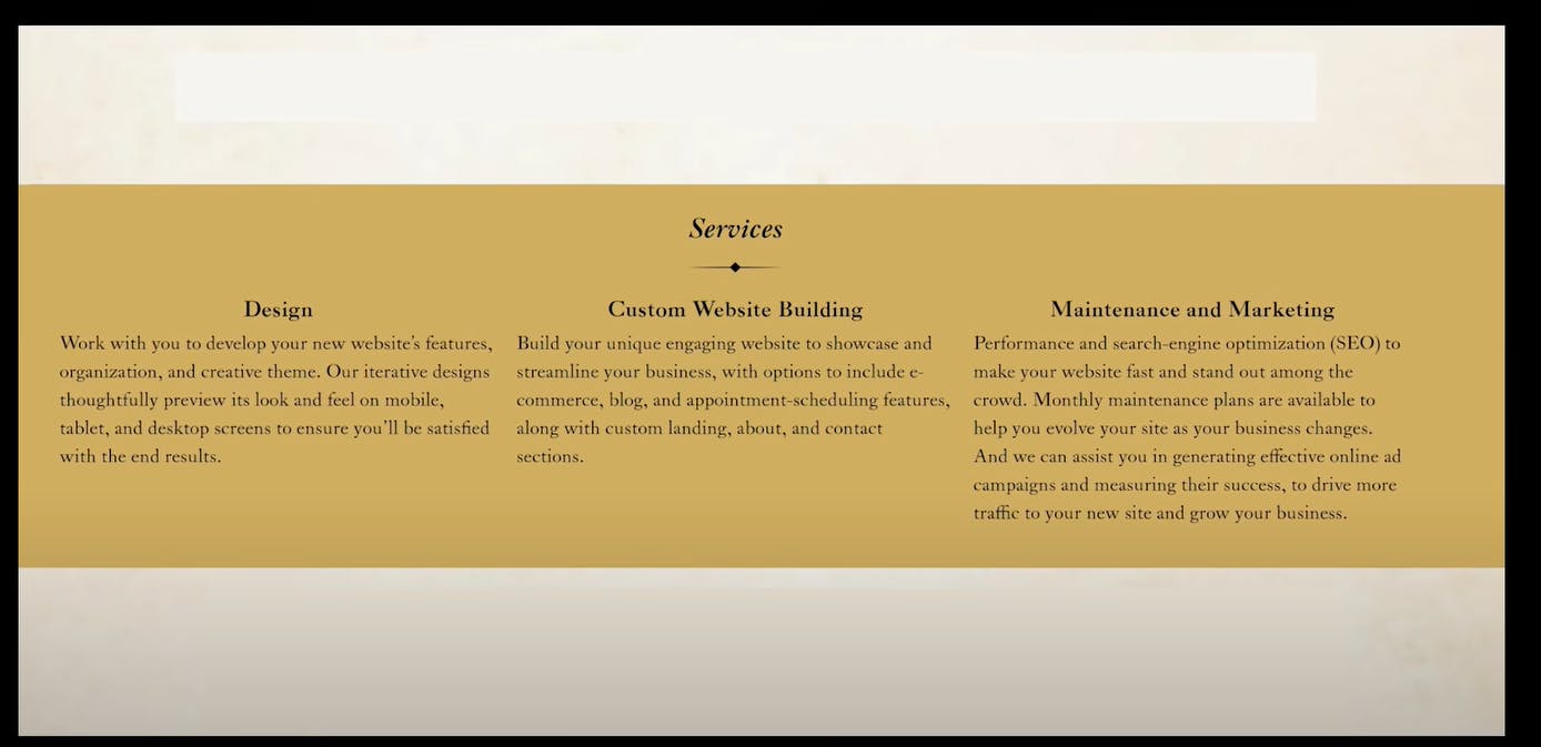
Critiques:
In all honesty, this entry isn't that bad 🤷♂️, the use of colour helps create a focus on the three different sections, the bolded title does just enough to give an idea of what information is available. The hierarchy isn't too shabby -- I guess the 'service' heading could have been more emphasised. But hey, Im not here to just make something 'mediocre', let's polish it up
The polish list (not the country)
- I want to add a welcome page, something to prompt users to see the information section
- The theme I am going to implement is something modest, Im going in this direction because of the gold background
- I want to change the font styles
- I want to reduce the colour's and make the page a little more minimalistic
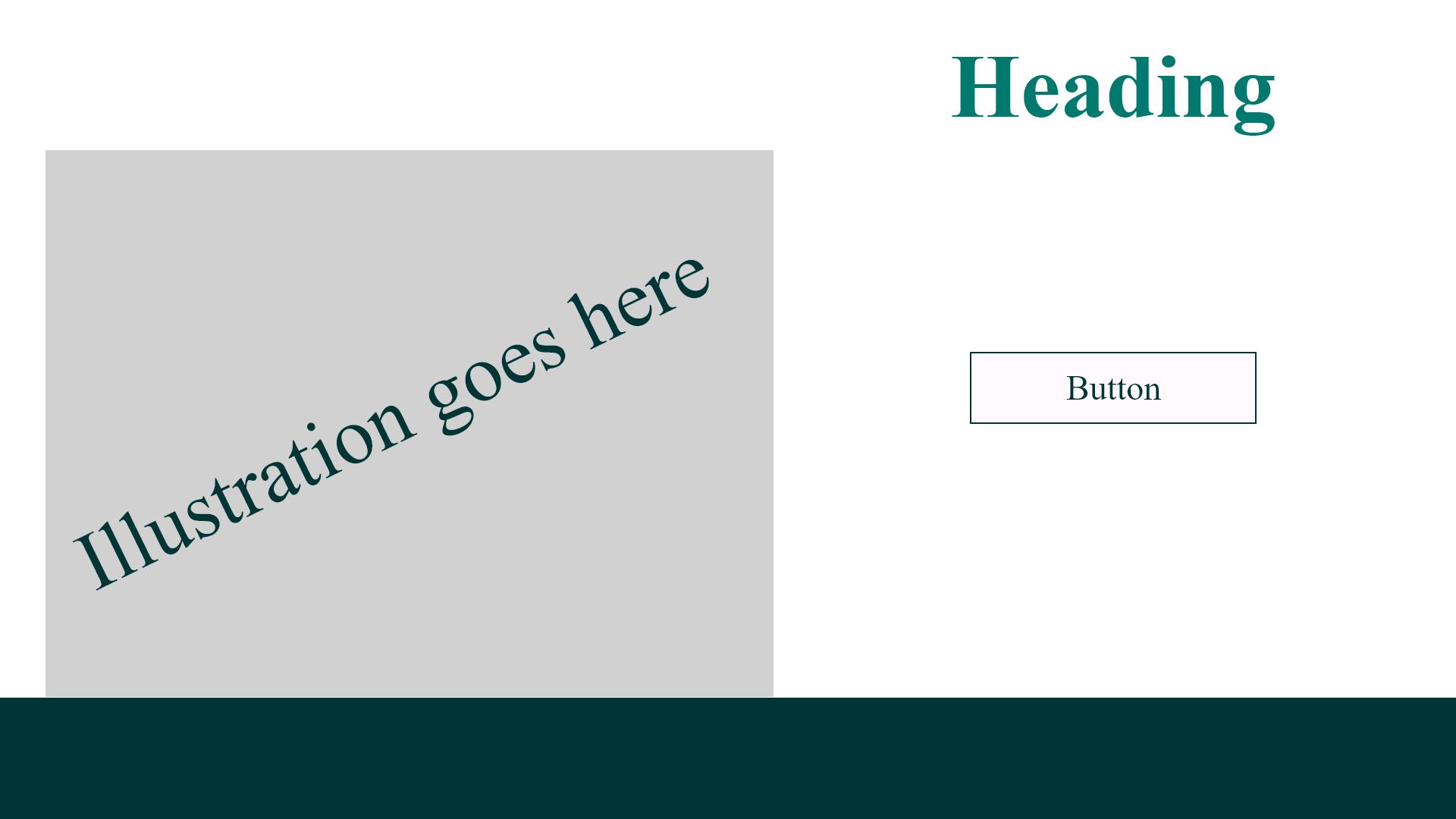
Initially, in my mind, I had this 'front' page layout. The reason why I chose to have a predecessor page before the service was because It allows me to split the communication, page one would focus on priming the users for the services offered, and page 2 could focus all its energy on showing those services.
The fonts
Fonts are essential components to designing a holistic feel, and sometimes it's difficult to chose which is the best font to utilize. I never went to design school so I usually source my fonts from type wolf (not sponsored). For this design in particular I decided to go for the classic times new roman and calibre combo.
 This is stage two of the front page design, I found the illustration from freepik.com (I lost the URL for the photo), I spaced the heading words to just consume some space on the left side. However, it still felt a little bland and lacking in appeal.
Page one final
 Better, I took the colour from the original entry and used it as an accent tone to the overall design. I also brought the image to the foreground and added a boarder to give it a little more focus, It also keeps the green from over-dominating the page.
Am I happy with this? In all honesty, I am not. Because there isn't enough story behind the whole entry I can't get too creative without going out of line, In my opinion, it looks very 2D and flat. And at this current moment in time, I don't yet know what to do about that.
I won't bore you with the progression for the service page, so here are the two final designs I was left to decide over.
service page 1| Overlapping lines and text
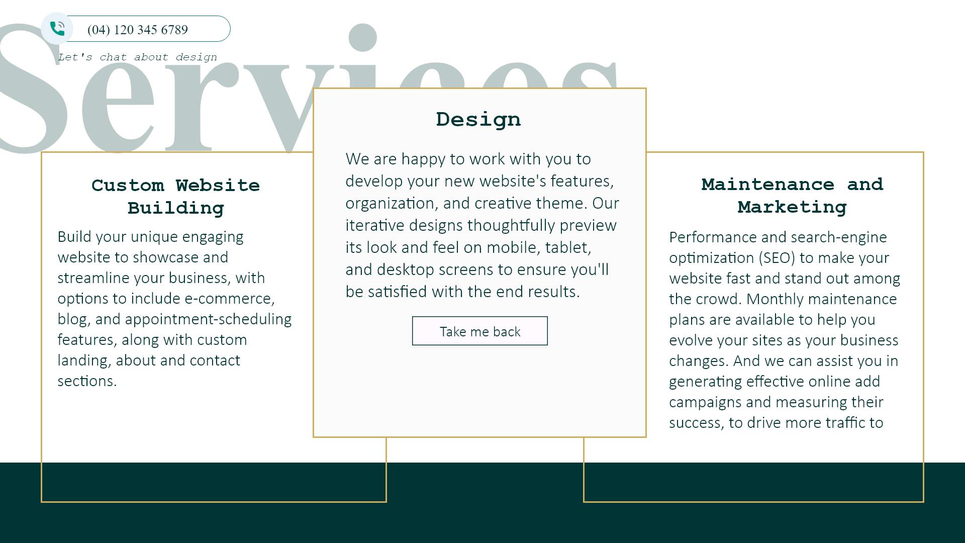
This first one broke the rule of being minimalistic, I placed "service" text behind the text with a low opacity mainly because the whole page started to look a little 'empty' without it. It's ironic how that's even a problem considering I wanted to make it more minimalistic but believe me when I say it did not look right. So I decided to place the service text somewhere else and align the text and main content in the centre of the page.
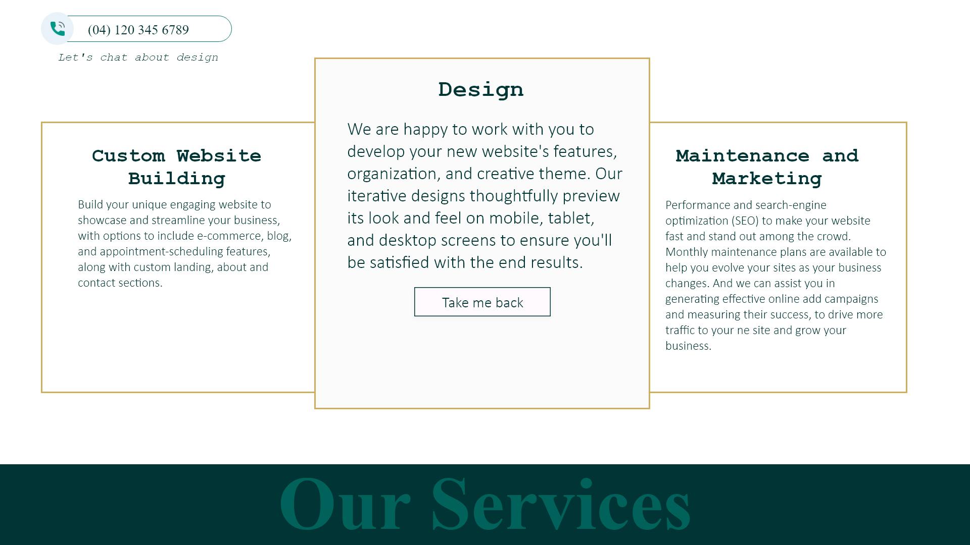
However, It still didn't look right, more specifically, it didn't have the attractive appeal that I was looking to create. Im still learning how to create appealing design pages and so im sure I have a long way to go before I can actually articulate the design flaws, errors. But for now, I decided to just question some of the things I did out of habit. Things such as:
- Adding The green banner at the bottom of the page (was it necessary?)
- What about adding more geometry?
- What would it look like with more color?
Here is where challenging my initial beliefs took me
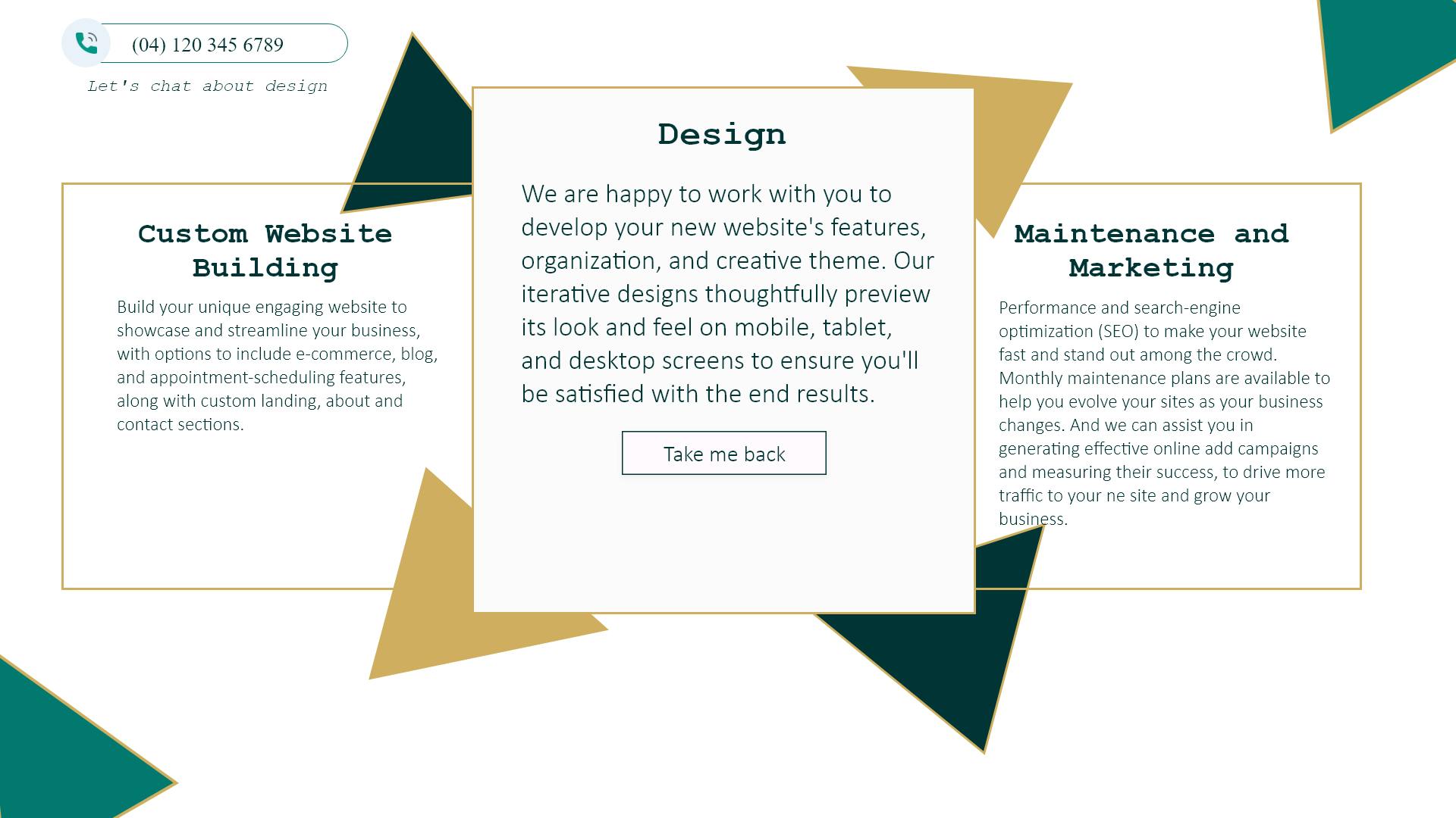 Am I happy with this?
No, this could have been executed better, So far what I have learnt is that I easily default to the 3 card information display method without challenging myself for why I go for that layout. Anyways, here is the wrap for entry 2:


