Study hard, practice hard, play ferociously.
I also forgot to upload the entry for day 3😅. Inspired by the legendary Gary Simon from Design Course, I decided to start a 100-day long web-design design challenge. In order to best learn and gain accountability, I will try and post it all here.
Check out his video if you want to also attempt redesigning the entries: Here is the link
The original entry| Sharing app
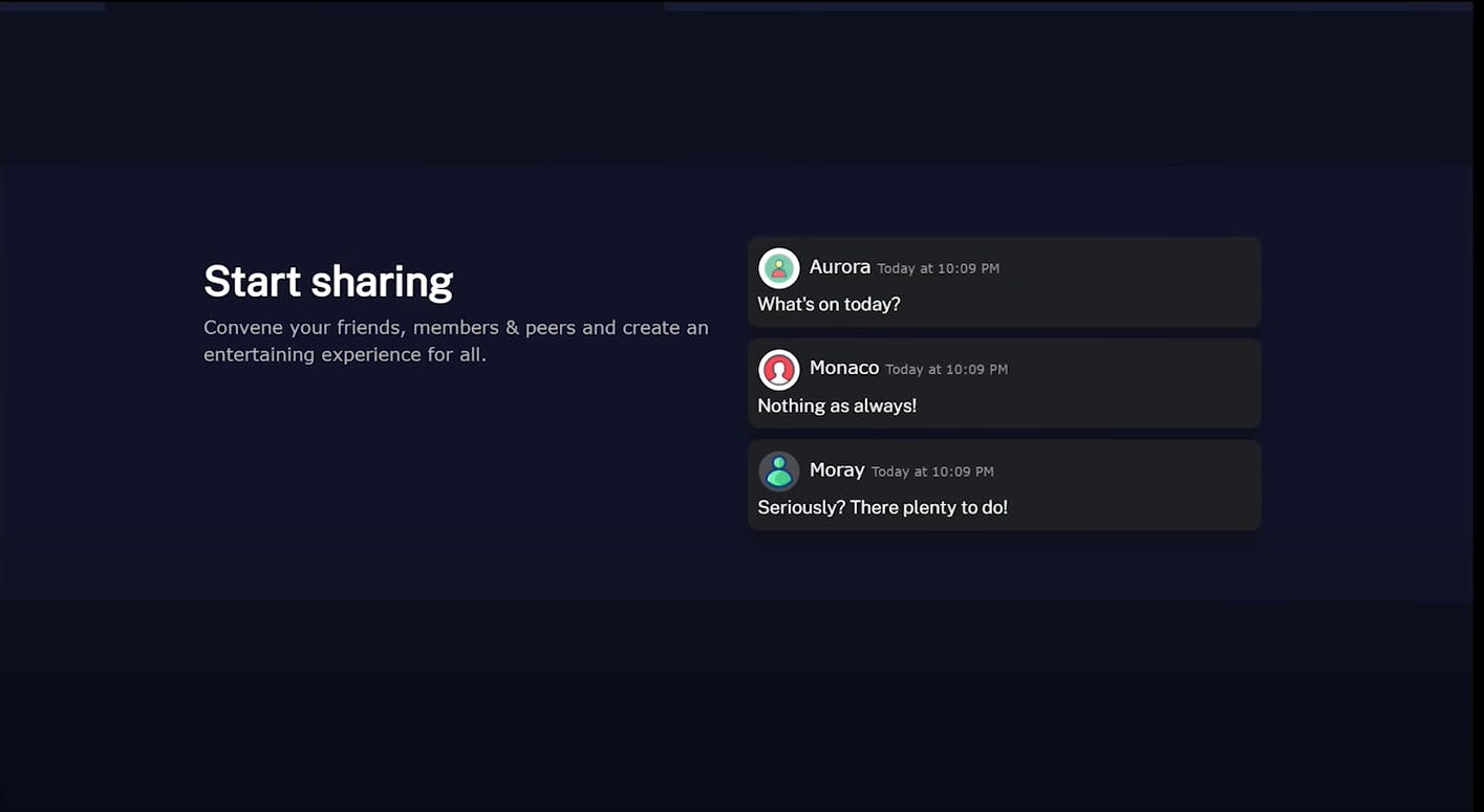
The things to change
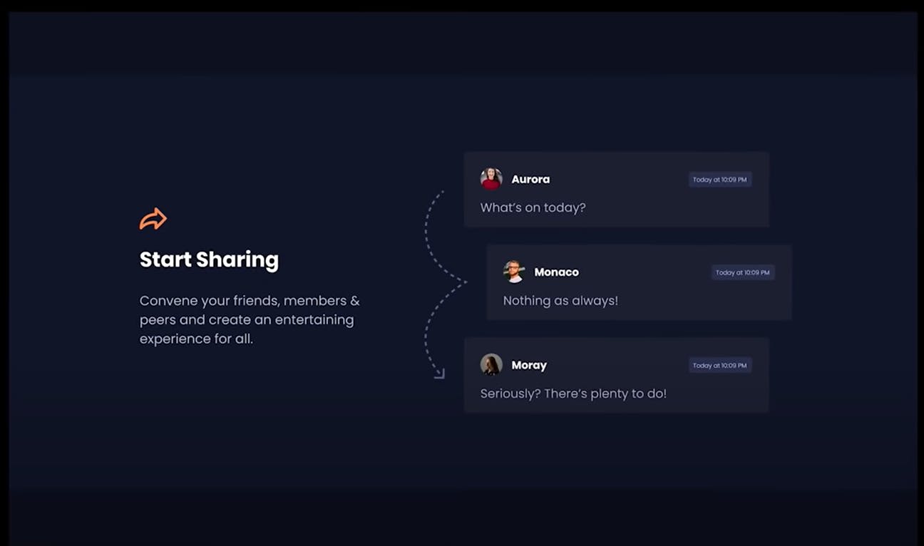 I decided to look to the great Gary for some inspiration.
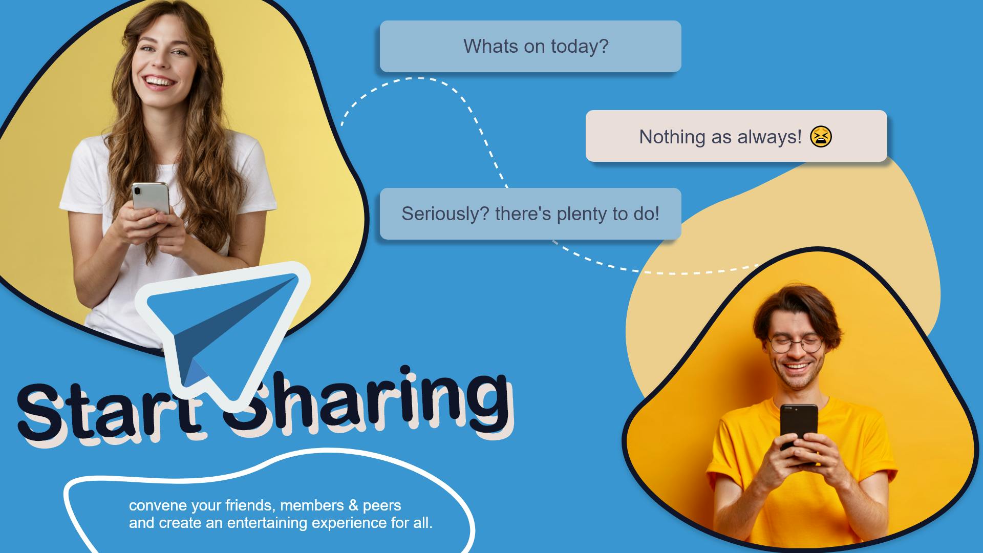
- I wanted to change the overall emotion communicated --something fun and exciting
- Since this is an app that focuses on sharing and communication, I thought adding some humans on site would make it more friendly and organic
- I wanted to give the page a little more life in colour
The colour pallet (coolors.co)
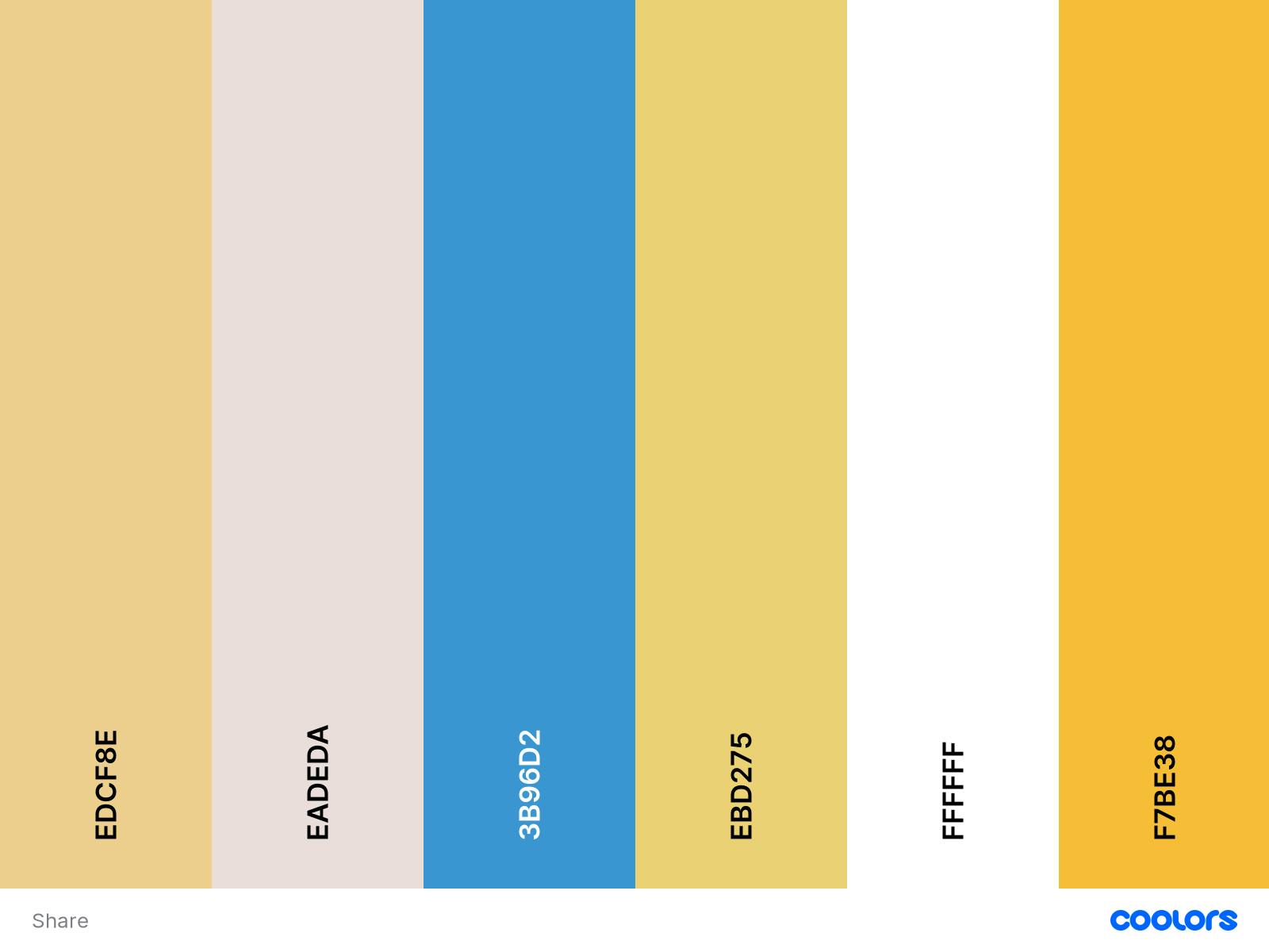 To get that fun and exciting feel to the design I selected these fresh colours. Caroline blue and pastel yellow are going to be the dominant colours on the site.
The fonts
Since this design is aimed at being friendly, I chose rounded bubbly text fonts. The one I decided to use was: Arial Rounded MT, however, for the text messages I needed something formal, so I went for z classic regular weighted Arial font.
Here is what It looked like in the end:
Here is the alternate colour design
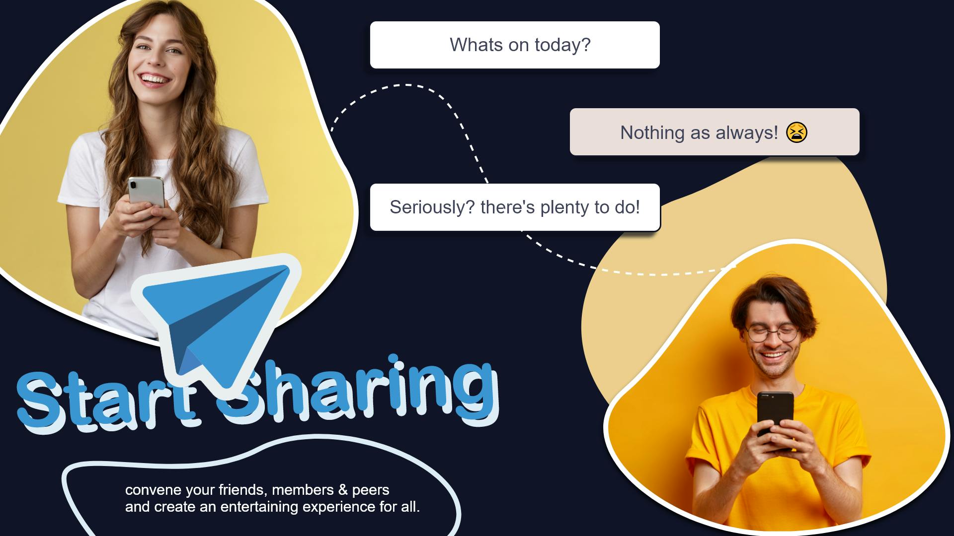
I intentionally chose a paper plane icon that looked almost like a sticker to enhance the friendliness of the whole design, it also functions to add a comfortable positive connotation. There isn't much to say about this design, to be honest.
References
The blue paper plane:
The two photos of those people: Technology photo created by benzoix - www.freepik.com
