Redesigning an Online Store Site| An inquistion to the function of E-commerce sites
Context: Cultivated by An awesome design on Dribble.com, I decided to tear it apart, find out its core principles and design my own version. Enjoy☕
More than just a portal for products and services, An OnlineStore should be a relationship between the User and the products. A symbiotic relationship that has meaning beyond price. --That is just in my oppinion
The inspiration
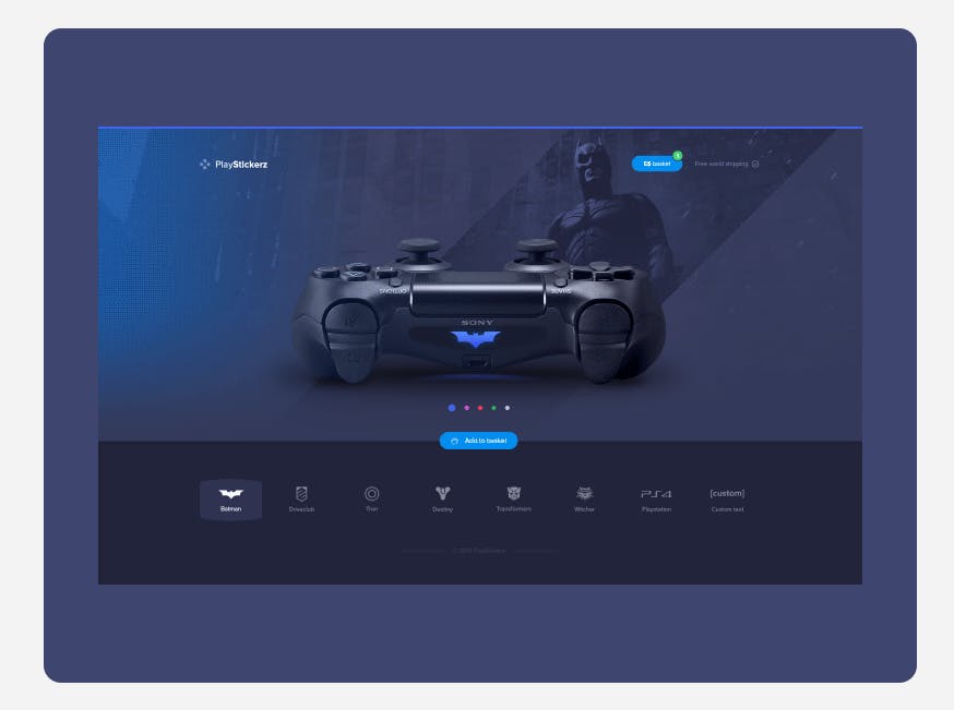
Colours, I felt like that as well as product placement is what made this site by Jaromir soo appealing. Let's be honest, as aspiring students of the web, we have all least encountered or realized that there is a certain paradigm, a certain design pattern when it comes to E-commerce sites. Yeaa😉 you know what I am talking about, that typical solid colour nav-banner with a hero image or carousel front page followed by a couple CTA (call to action) prompts here and there. I feel like it has something to do with the growing popularity of E-commerce and no-code website-building platforms like Shopify, Webflow, Wix and grampa's favourite Weetbix *I mean Weebly. Here is an example of what I mean:
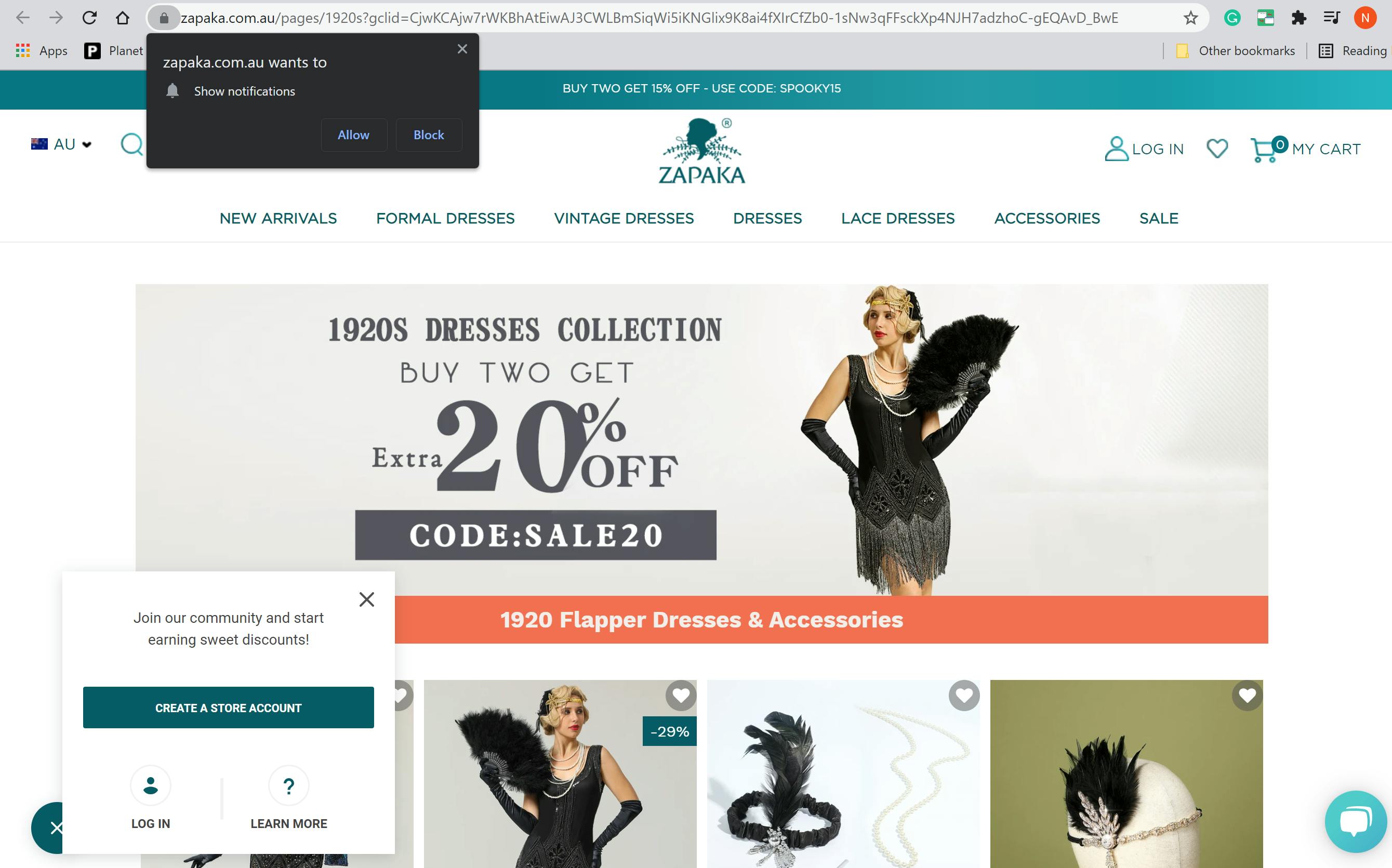
And to balance this out check out this Shopify site, I would be lying if I said it isn't good. It's the story behind the products that give it meaning.
Whatever it might be, something has drastically reduced the quality of E-commerce sites Excuse me, let me be more specific. Something has sapped the creativity and appeal of what used to be a relationship between products and Customers and reduced it to just a portal. I call them portals because in reality, that is what most E-commerce sites have become, a gateway to just about whatever the Consumer desires. And sadly this 'portal' functionality is the only way people see E-commerce sites now. Just fancy portals with different names and products. Anyways, Enough ranting about the dying beauty of E-commerce sites. Let's deconstruct that bad boy and learn something.
The Breakdown
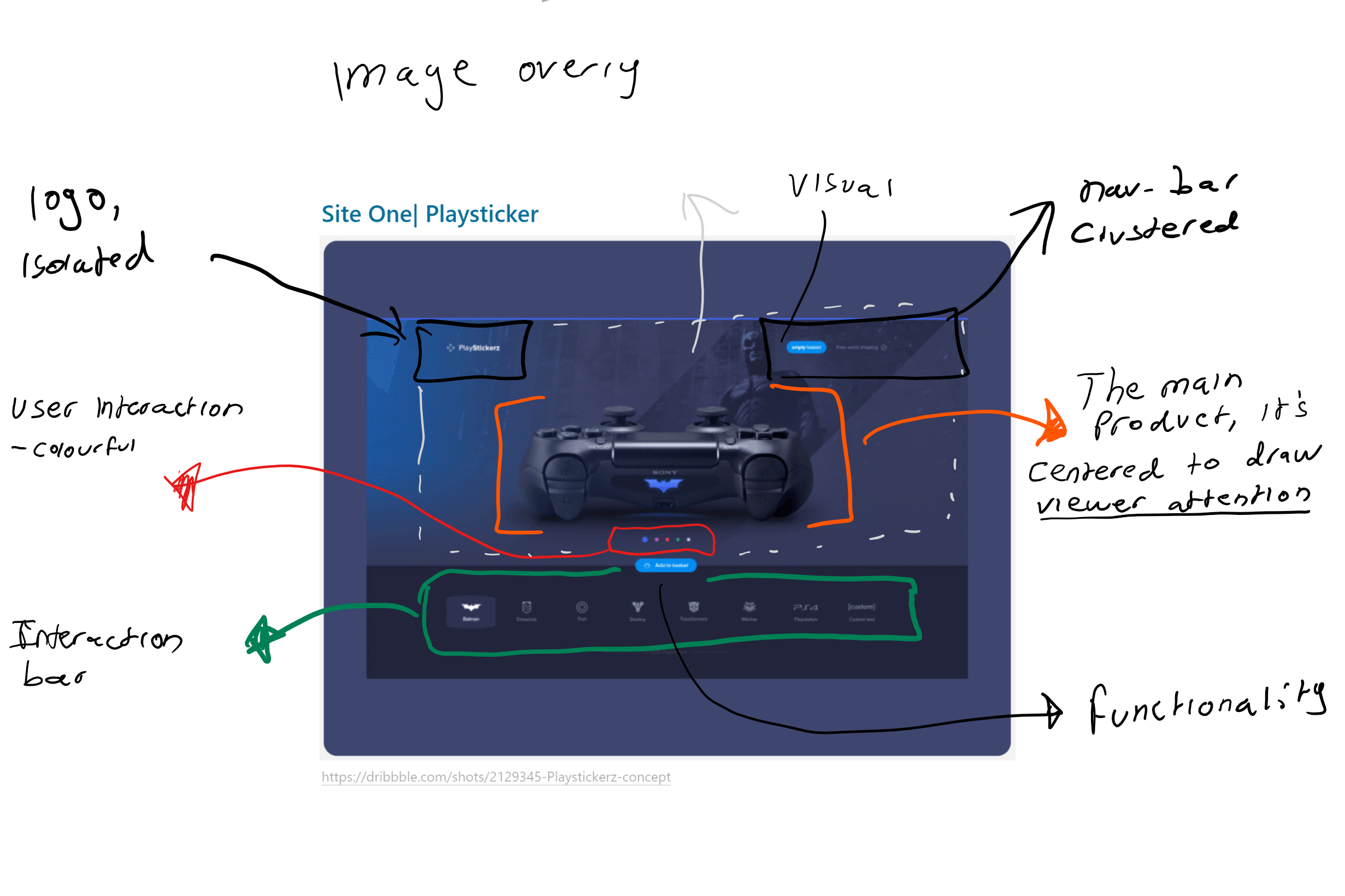 Please excuse my grade 3 handwriting, What stood out to me about this site wasn't so much the product itself, rather it's the impression. I will explain more about 'the impression' afterwards, but because I know we all love analytical formats I will break this down into the 3 principles used within that website. Colour, Interaction, and Focus.
Colours | You don't need a fancy pallet to produce art
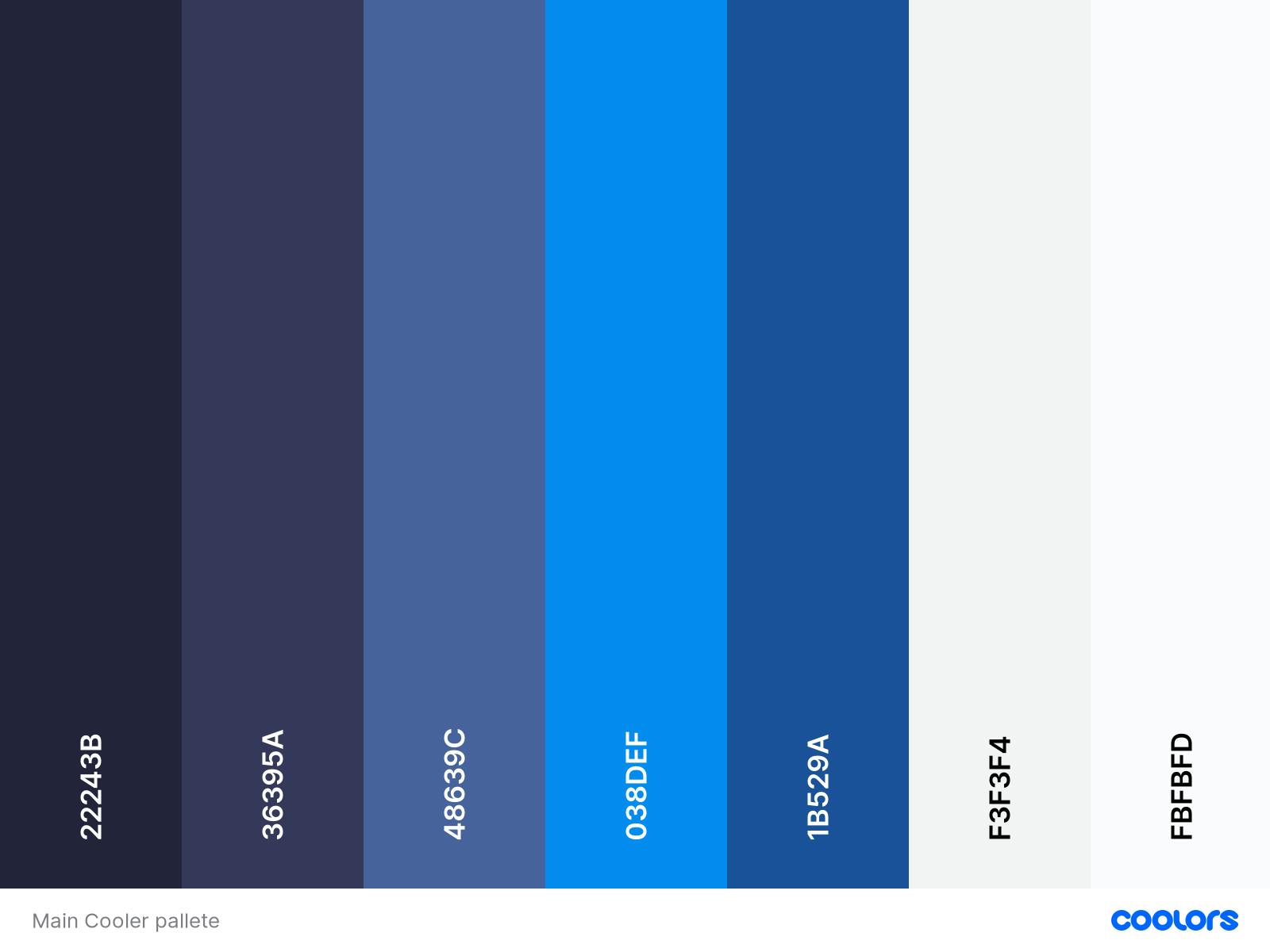
Colour without form or direction is just spilt paint
Colours done right can create an overall Theme to a webpage, a theme is essentially an important recurring pattern; be it an idea, a picture or even a colour. Themes are just one of the many things that help give a site an emotional context. Notice how the majority of this site is composed of different shades of blue. Even without looking at the PlayStation controller, Users are immediately drawn to the feeling of being on a PlayStation home screen. Remove the colours of the site and that controller loses its most important context. It's the glows and light banners, in particular, that is most reminiscent of a typical PlayStation login. I wanted to utilize this same theory within my site. These are the remaining coolers that the creator sprinkled gently around the page.
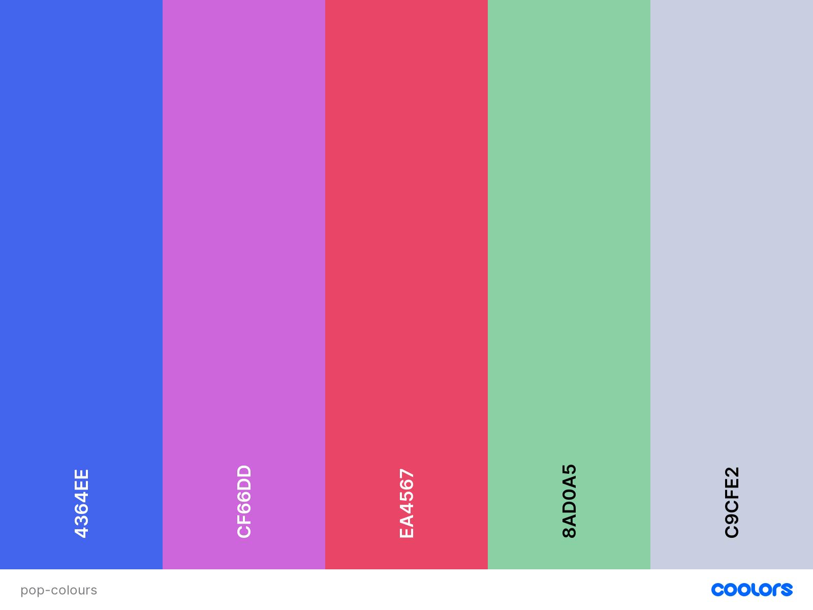
Interaction |
If there is anything special we learnt from Disney movies it's the joy of communicating. Even with inanimate objects, we have learnt to desire spontaneity from toys, cars and household objects.
I believe this desire to communicate has definitely infected web design, and THANK GOD. Imagine a world where the most interaction from a website came from buttons and images😭. However, this "Playsticker" site doesn't truly capitalize on this idea. Nevertheless, I will aim to incorporate it into my project anyway. I'm not too sure how much explanation is needed for this principle (please let me know)
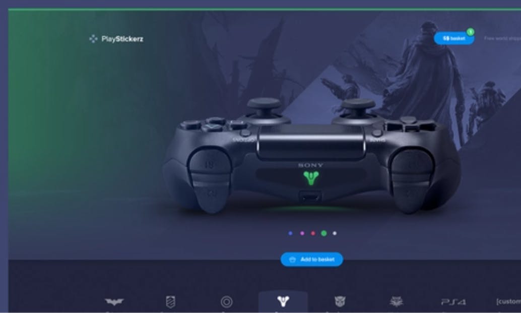
Colour based interaction| This site does not use any 'grand' animations, there are only transitional animations between the functions. Otherwise, All engagement takes the form of dynamic colour changes
Is it effective?| For its purpose yes, The creator knows that the site overall has minimal functionality(just selecting stickers), so there is no need to add excessive movement or actions to the site, an imbalance of engagement and functionality can cause confusion and give a false presentation for what the site is capable of doing. Here are some other interaction elements I would add:
- It could be more engaging if users could pivot the controller side to side.
- I think giving users a bit more control over colours would be better
It's hard enough explaining colours so please just visit the dribble site to get an idea of what I mean by interaction. To sum it up; when a user clicks on a sticker these things occur:
A different colour glows on the side of the page
The top banner of the site changes colour
A different sticker is applied to the controller
The background of the site changes
Yes, I know, these changes aren't anything special. And that's because Individually they don't do very much but when applied collectively in a smooth transition, They change the whole feeling of the website, It becomes immersive. Maybe it's just me but Im sure there is some level of delight, some magical feeling that is attached to clicking a preference and having a whole room change in response to that preference. In my full bias opinion:
Not many E-commerce sites have the balls to insert an interaction that does more than just re-route to another page or reveal the price. But by the massive sac's of confidence, this creator did more than what 50% of most E-platforms would ever dream of. And I applauded and envy that.
Again, this isn't the best site to demonstrate the power of immersive interaction. I will probably write something more specific about that topic one day, but not today. Today we are Creating digital life in the form of a website.
⚠ Interjection| Im only joking here, of course, I understand that there is a lot of thought that goes into the logic for inserting particular interactions, I would hate for you to mistake my opinions for ignorance, I may be stupid to a degree but im not that stupid
Focus| What is the main focus within the site? Where should I be looking
Always assume that Users know what they want, that way you don't have to sell them anything, just focus on enhancing their shopping experience.
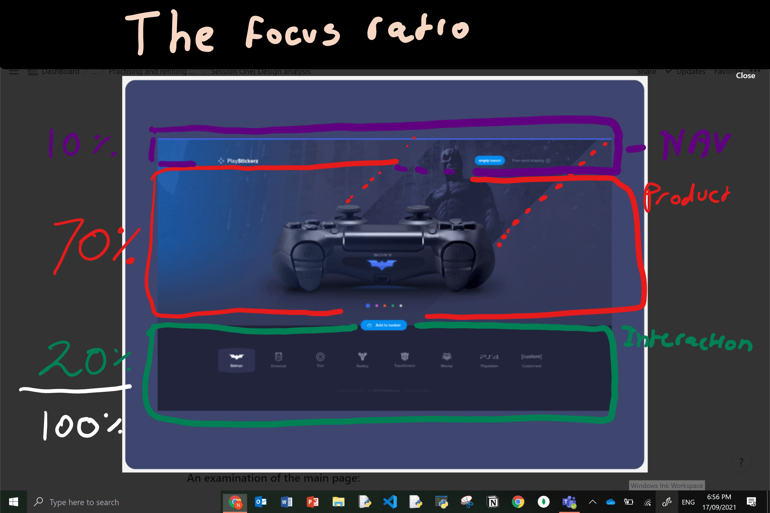 A breakdown of the focal points —> relative to the size and appeal of each element
Let's do some fundamental analyses first:
What is the purpose of the website: It's a digital service platform for customizing your ps4 controller. Once a user is satisfied with their sticker choice the site has completed its purpose.
What type of site is it: online store. It's interesting to me how I didn't even realize that I was on an E-commerce platform, my mind was too immersed in the service it provided that It almost feels like I'm interacting with the product rather than the site.
the layout of the site:
- Navigation elements —> page identity | The user's cart | Awareness of the services shipping prices (free)
- The Main product
- The interaction elements
Notes on how the website is laid out
- Free space| spacing is utilized around the controller to give users a more absorbed view of their product.
- Separation| To create a clear separation of the bottom section, a darker tone is applied to give emphasis to that section.
- The lesson| Your product or service should take up most of the user's attention. It should take at least 60% of their focus. The other elements should not require much attention.
The room analogy (this is an original metaphor)
Think of websites as actual shopping stores. Take for example an E-commerce site; If you were to go to its physical shopping store, instinctively your mind will move towards "the what" — what you're there for: and that's usually for the product or some service. Then the next question that follows is "well... How do I get to that particular product or service?" immediately your mind will unconsciously start evaluating the ways to get to that product or service: in clothing stores (as a male) I would look for the male's section to get a specific shirt I am after. (keep in mind that culture does play a role in how we instinctively behave within shopping stores- it just so happens where I live most shopping stores communicate their navigation with signs).
Humans are not very complicated creatures when it comes to getting what we want; it's actually simple, we first look for the "What" then figure out the "how".
And so the key takeaway here is that a website should not disturb this inbuilt biological system of product hunting. Instead, It should enhance that experience and make it fun and rewarding. And so, I will try and make it a habit to add simple features for navigation that don't compete against the product or services focus. Put simply In my own design I will keep my navigation elements visible enough to know where to go but not too visible that It takes focus away from the product or service.
Alright, To sum it all up here are the lessons I learnt during this project:
- Aim to create an E-commerce site that makes users feel like they are interacting with the product rather than the site.
- If you want to make a site more user personalized - don't tell them what to do, Just make it easier for them to do what they want
- Sometimes you don't need fancy animations, Just adding a dynamic colour interaction is enough to add life to the site
- If you are selling a product or service, it should take up at least 60% of your page.
👋Hey you| This is was my first ever blog post on HashNote/In general, so apologies if anything didn't make sense
😔This journal entry might be too long to read so Im going to end this here and continue another day. Not sure if you noticed, but the cover image of this post is what I ended up creating, I will probably explain my process some other day. Anyways hope you enjoyed reading that as much as I enjoyed writing it, PLEASE give me feedback on any tips for how I could communicate better, and DM me privately if I said something you thought was stupid and I will try to clarify.
All I know about Webdesign Is that I know nothing, which is why I will question and interrogate until I can understand something. But until then, I will keep on learning.
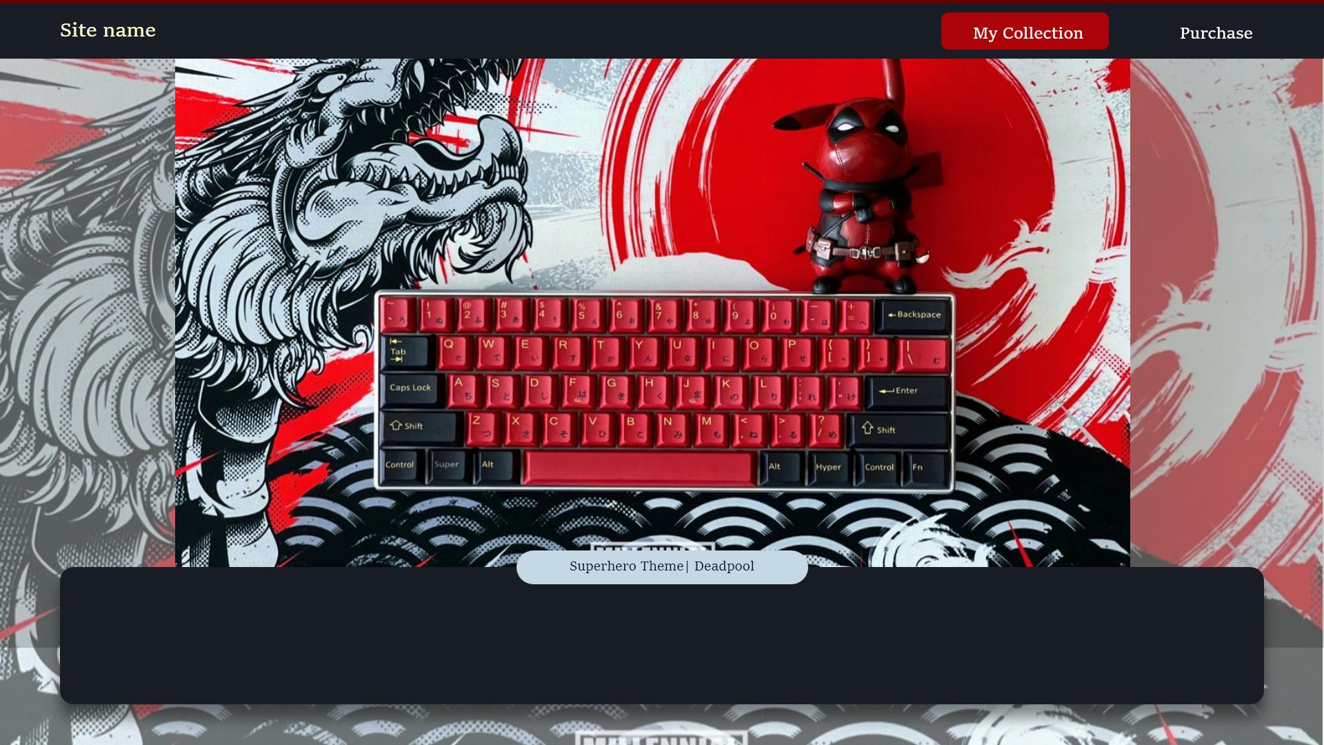 Just so you have an idea of how Bad I started, here is the first draft I made🙈